The Visual Studio UI Refresh Preview is here!
>>> Shared from Original Post Visual Studio Blog
Back in May, we showed a first look into the UI Refresh that we’ve been working on for Visual Studio. We’ve been working on a refresh for the Visual Studio UI to improve productivity, create a more inclusive environment, and keep up with evolving global accessibility requirements. The feedback we’ve collected from that first post and the developer community ticket has been wonderful. We’ve been spending the time since then working through all your comments to ensure your valuable feedback gets weaved into the UI Refresh. Now, here at Ignite, we’re excited to finally make a version of the UI Refresh available for folks to try for themselves.

To enable the UI Refresh, first go to Tools > Manage Preview Features from the main menu in Visual Studio. Then, look for “Experimental control styles”. Once that box is checked, you’ll need to restart Visual Studio for the UI Refresh to be enabled.
Driven by feedback
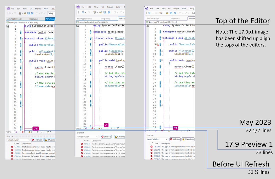
The fundamentals of the new experience haven’t changed. Our main goals are still based around the Fluent design language and focus on three pillars: cohesiveness, accessibility, and productivity. However, since we revealed the images in our first post, we got a lot of feedback about the things that our developers found important. In this version of the UI Refresh, you’ll get to experience a balance of the feedback we received with the accessibility requirements around things like clickable target space and reduction of visual clutter. This means a more inclusive experience to help everyone be more productive and comfortable while still maximizing code space and respecting the feedback you’ve shared with us. As an example of this, the first screenshots we shared, showed a reduction of nearly a full line of code in the editor space, but the editor in 17.9 preview 1 is only reduced by a quarter of a line.

We’ve found that we can meet the ideals of the Fluent design language while still prioritizing the things that our developers say are the most important. Now, this experience is ready for you to try so we can continue to build on your feedback. Our journey isn’t done yet; your feedback is absolutely critical! At this time, we don’t have a timeline for when this will be the primary UX for Visual Studio, which is why we’re spending so much time working with our users to get as much information as we possibly can.
A cohesive and colorful experience
One of the pillars of the Fluent UI design language is around cohesiveness. For the Visual Studio UI Refresh, this has been most evident in the simplification of the colors that we use in Visual Studio. Styles across Visual Studio before the UI Refresh used over 4,000 color tokens which were difficult to maintain and were easily misused. This frequently led to inconsistent experiences, accessibility issues and many other issues that led to an experience that didn’t feel cohesive. The new refreshed styles use only about one hundred tokens, which may still seem like a lot, but are much easier to maintain and will make it easier to spot incorrect use. This is leading to more consistency, and we believe will result in the cohesive experience that will make Visual Studio more comfortable to use.
Our current blue theme has some compatibility issues that we couldn’t iron out in time for Ignite, and instead of delaying this preview, we’ve had to make the decision to make it unavailable for now. We’re also aware that 3rd party themes may run into similar complications, so those may not work as expected with the UI Refresh yet. We’re working on both issues, so stay tuned and we’ll update as we make progress.
One of the benefits of streamlining the color service is that we can provide a fresher set of color themes beyond the basic “Dark” and “Light”. We’re calling these the new “Tinted” themes, and you can take a look at these below.
These tinted themes are inspired by Microsoft Edge and give Visual Studio a new, fresh look beyond the simple Light and Dark that have been the mainstay for the last decade. These themes can be found when the UI Refresh has been enabled and can be accessed either from the Tools > Theme or from the “color theme” combobox under Environment > Visual Experience in Tools\Options.
We want to hear from you
We’re excited to hear what folks think now that you can try out the UI Refresh instead of simply seeing static screenshots. We know that there’s still more we need to do. When switching to the tinted themes, customers not using the default Cascadia font will need to set their font back to their font of choice, and custom themes may not be compatible with the UI Refresh at this time. This is the first preview, but it certainly won’t be the last.
To share your feedback on the UI Refresh, you can join the discussion on Developer Community. If you want to share your feedback on the Tinted Themes, we’ve got a Developer Community discussion specifically for that too. We want to thank all our folks again for all the feedback that has gotten us this far and we’re eager to continue this conversation. Stay tuned here and in Developer Community as we continue down this journey.
The post The Visual Studio UI Refresh Preview is here! appeared first on Visual Studio Blog.
>>> Read the Full Story at Visual Studio Blog